You've decided you want a metal card. Good decision. Now comes the part that trips most people up: which finish?
The design is one thing. But the finish — Matte Black, Gold, Mirror Chrome, Brass, Carbon Fiber, Blue — changes everything about how a card looks, feels, and reads to other people. This is the guide to getting it right.
Matte Black
Serious. Restrained. Unapologetically premium without trying to be.
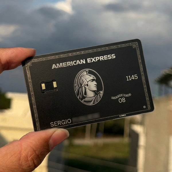
Matte black is the default finish for a reason. It photographs well, it doesn't show fingerprints, it pairs with every design, and it communicates precisely the right thing in almost every context. When someone pulls a matte black stainless steel card from their wallet, the impression is immediate: this person cares about what they carry.


Best for: The Black Centurion, Goldman Lampe Black, JP Morgan Reserve, Joker, Premier Black Card. Also the safest choice if you're unsure — matte black almost never misses.
Avoid if: You want visual flash. Matte black earns its compliments through weight and feel, not colour.
Gold
Warm. Authoritative. Classically wealthy.
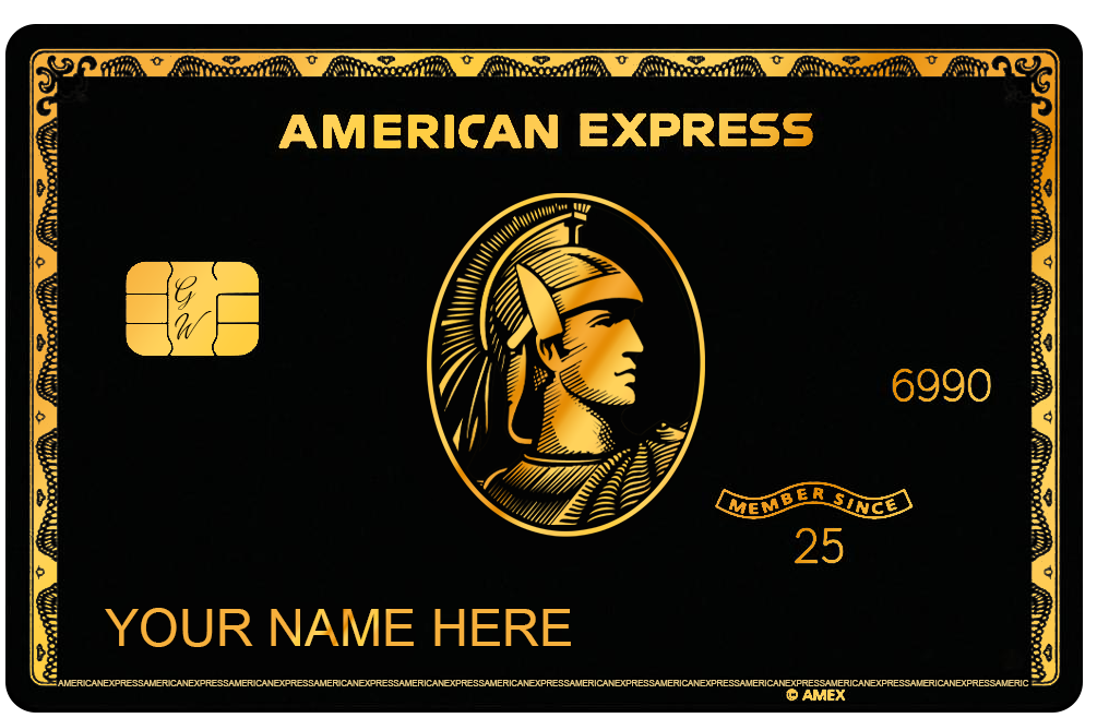
Gold is the colour that's been synonymous with value for longer than recorded history. On a stainless steel card it carries a warmth that black and silver don't. The 24K Gold AMEX is opulent and unapologetic; the Gold AMEX is classic and understated; the Gold Bitcoin is about conviction.


Best for: AMEX-style cards, banking prestige designs, Monopoly-themed cards.
Avoid if: You want the card to feel cold and precise — gold reads warm and bold.
Silver / Platinum
Cool. Precise. Understated prestige.
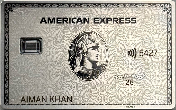
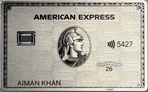
Silver reads as more European than gold — the aesthetic of Swiss banking and private wealth management. The Platinum AMEX and Goldman Lampe Silver both sit in this register. It's the finish for people who find gold slightly too obvious and black slightly too severe.


Best for: Platinum AMEX, Mirror Platinum, Art Platinum, Coutts Silk, Apple Card.
Avoid if: You want the card to dominate a room. Silver is refined rather than dominant.
Mirror / Chrome
Maximum visual impact. The card that makes people stop mid-sentence.
A mirror-finish card reflects the entire room back at whoever's looking at it. The Mirror Platinum AMEX is one of our most dramatic pieces — you don't anticipate the reflection until it's in your hand, and then it's genuinely hard to look away. Mirror finishes are also the most photogenic cards we make.

Best for: Collector pieces, gift purchases, anyone whose personality matches the statement.
Avoid if: You want everyday carry discretion. Mirror cards attract attention every single time.
Brass
Rich. Tactile. Old-world premium without the coldness of steel.
Brass has a warmth that gold doesn't quite replicate — less polished, more substantial. Cards in Brass have a weight and warmth that makes them feel genuinely handcrafted. The laser etching catches differently on Brass and gives it a depth that flatter finishes can't match.


Best for: Intricate designs — Hokusai Wave, Dragon, Yakuza, any card with complex linework.
Avoid if: You want a clean, modern look. Brass is artisanal warm, not tech cool.
Carbon Fiber
High-performance. Technical. The material language of Formula 1 and superbikes.
Carbon fiber is for people who think of themselves as optimised rather than luxurious. The texture replicates the woven look of real CF on a stainless steel base — dark, technical, immediately recognisable to anyone who's ever seen a CF part up close.

Best for: Carbon AMEX, Premier Black Card, Overpowered Card.
Avoid if: You want warmth. Carbon Fiber is cool in both temperature and personality.
Blue / Brushed Blue / Mirror Blue
Bold and distinctive. The unexpected choice that becomes the most memorable one.
Blue is the rarest colour in most wallets. That's exactly why it works. A deep blue stainless steel card stands out the moment it leaves a cardholder — not because it's loud, but because it's so unexpected. Brushed Blue softens the colour slightly; Mirror Blue is the most vivid and reflective of the three.


Best for: Blue AMEX, Dragon of the East, Hokusai Wave, Dragon Card, UNO Reverse.
Avoid if: You want the card to read as classically prestigious. Blue is distinctive, not conventional.
Quick Reference Guide
| Finish | Vibe | Best Example |
|---|---|---|
| Matte Black | Premium, serious | Black Centurion |
| Gold | Warm, wealthy | 24K Gold AMEX |
| Silver / Platinum | Refined, European | Platinum AMEX |
| Mirror Chrome | Maximum impact | Mirror Platinum |
| Brass | Artisanal, tactile | Joker Card |
| Carbon Fiber | Technical, performance | Carbon AMEX |
| Blue | Distinctive, unexpected | Blue AMEX |
If you're genuinely torn between two finishes, go darker — matte black and deep finishes age better in a wallet than bright or polished options. But if a finish immediately jumps out at you, trust that instinct. The best metal card is the one you're excited to carry.